Try to uncover clusters among time series data
Clustering is an unsupervised data mining technique for organizing data series into groups based on their similarity. In this post we make a focus on clustering large number of Time Series. Though the objective of the technique remains the same (maximize data similarity within clusters and minimize it across clusters) the implementation details are adapted to this particular data type.
Clustering is the practice of finding hidden patterns or similar groups in data. (Roelofsen, 2018)

Why clustering time series?
Clustering is employed to identify subgroups within a dataset, constituting an unsupervised approach as it entails uncovering inherent structures, such as distinct clusters, within the dataset.
Both clustering and PCA (Principal Component Analysis) aim to simplify data by summarizing it, yet their methods diverge:
- PCA aims to discover a low-dimensional representation of the data points that can explain a good fraction of the variance.
- Clustering, on the other hand, aims to identify homogeneous subgroups among the data points.
In the context of time-series visualization, clustering serves as an exploratory technique where we create clusters while considering the entire time series as a unified entity. The primary steps involved in this process are as follows:
- Preprocessing method: mean variance scaler
- Determining a distance measure to quantify the similarity between observations
- Prototype, choose a centroid that summarizes the characteristics of all series in a cluster
- Choosing the algorithm to obtain the cluster, most common are partitional or hierarchical
- And evaluate the results via cluster validity indices
The Theory
1. Preprocessing method: Mean Variance Scaler
Since the selected metric is affected by scaling, we need to preprocess the time series with caution. The TimeSeriesScalerMeanVariance scaler is designed to ensure that each resulting time series has a mean of zero and a variance of one. The underlying assumption is that the range of a specific time series doesn’t provide meaningful information, and the goal is solely to compare shapes in a way that is invariant to amplitude.
2. Metric: Dynamic Time Warping
Dynamic Time Warping (DTW), among the most widely utilized measures for time series analysis, was developed to address certain limitations of simpler similarity metrics like the Euclidean distance:
- It has the ability to handle time series of varying lengths.
- Unlike straightforward metrics, DTW doesn’t merely compare the values of both time series point by point; it takes into account the temporal correlation between values, which often occurs with different lags.
DTW constructs a square matrix of size \(m \times n\), calculating squared distances between corresponding points of the two time series. This matrix serves as a cost matrix when searching for the most economical path between points \((1,1)\) and \((m,n)\), and this path’s cost quantifies the similarity.
The dynamic time warping score is defined as the minimum cost among all the warping paths:
\[DTW(X,Y) = \min_{p \in \mathcal{P}} C_p(X,Y)\]where \(\mathcal{P}\) is the set of warping paths.
Here are some noteworthy characteristics and considerations regarding DTW:
- It is sensitive to scaling, meaning that the scaling techniques applied will influence the metric and, consequently, the outcomes of clustering.
- The time complexity of DTW is proportional to \(O(nm)\), where \(n\) and \(m\) represent the lengths of the compared time series.
- DTW permits the comparison of time series with dissimilar lengths. This characteristic may not necessarily be an advantage, as studies have demonstrated that employing linear reinterpolation to obtain equal length may be appropriate when the lengths of the time series, denoted as \(m\) and \(n\), do not vary significantly.
3. Prototyping with DTW Barycenter Averaging
In the clustering domain, a prototype refers to a single time series that provides a condensed representation of all the series within a cluster. In our context, we employ the DBA method to derive this prototype.
The DTW Barycenter Averaging method, or DBA method, necessitates the selection of a reference series, often referred to as a centroid, typically chosen randomly from the dataset. During each iteration of this method, the DTW alignment is calculated between the chosen centroid and each series of the cluster \(C\).
DBA is an iterative, global method. The latter means that the order in which the series enter the prototyping function does not affect the outcome. It is estimated through Expectation-Maximization algorithm.
4. The algorithm: DBA-k-means
K-means is an iterative clustering technique that necessitates a predetermined number of clusters and may converge to local optima due to its nature as a combinatorial optimization problem. While it can yield satisfactory cluster results, it lacks confidence indicators for cluster membership.
The essence of K-means lies in minimizing intra-cluster distance while maximizing inter-cluster distance. However, achieving the optimal solution for large datasets is often infeasible. Instead, iterative greedy descent strategies are employed, focusing on a subset of the search space until convergence.
In partitional clustering algorithms, the process typically starts with the random initialization of \(k\) centroids, often by selecting \(k\) objects from the dataset at random. These become individual clusters. Distances between all objects and centroids are then calculated, and each object is assigned to the cluster with the nearest centroid. Subsequently, a prototyping function is used to update the corresponding centroid for each cluster. This process of updating distances and centroids continues iteratively until a set number of iterations have been completed or no objects change clusters any more.
5. Evaluation with the Silhouette Score
In accordance with Cluster Validity Indices (CVIs), which provide a standardized framework for evaluating clusters, the Silhouette score is tailored for crisp partitions. It operates as an internal metric, as it exclusively assesses the partitioned data in an attempt to quantify cluster purity.
Calculating the Silhouette index necessitates the computation of the entire cross-distance matrix among the original series. Consequently, this process can be computationally demanding, particularly when dealing with very large dataset of timeseries.
For any data point \(i \in C_I\) let \(a(\cdot)\) be a measure of how well \(i\) is assigned to its cluster, the smaller the value the better the assignement:
\[a(i) = { 1 \over | C_I | - 1 } \sum_{j \in C_I, i \neq j} d(i,j)\]Then let \(b(\cdot)\) be the mean dissimilarity of point \(i\) to its neigbooring cluster \(C_N\), the mean distance of \(i\) to all points in the closest cluster, where \(C_N\) is a subset of \(C_J\) and \(C_N \neq C_I\)
\[b(i) = \min_{J \neq I} { 1 \over | C_J | }\sum_{j \in C_J} d(i,j)\]And finally, let \(s(\cdot)\) be the silhouette value for any given data point \(i\):
\[s(i) = { b(i) - a(i) \over \max\{ a(i), b(i) \} } \text{, if }|C_I| > 1\]Then mean of the silhouette scores across all data points \(i\), is a measure of how grouped all the points are, how well the clusters are well formed.
\[mean \left ( s(i) \right ) = { 1 \over n }\sum_{i} { b(i) - a(i) \over \max \{ a(i), b(i) \} }\]The Application
In this part, we put the previously discussed theory into practice with a collection of time series data. To do this, I opted to retrieve data from the French Webstat API.
Webstat data
Webstat acts as the statistical hub for both the Bank of France and its affiliated institutions. Through the Webstat API, individuals have the ability to tap into a vast repository of over 35,000 statistical series encompassing economic and financial information about French companies, regional economic dynamics, trends in credit and savings, and comprehensive details about currency and balance of payments.
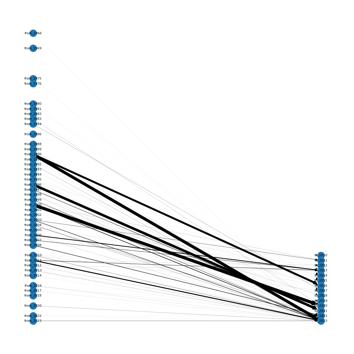
From the thousands time series scraped, I filtered about 500 of them, on the main criteria of the start and end of the series, and their sampling rates. Hereafter, is a diagram representing the number of time series (represented by the thickness of the arrow), going from, and ending at.
Out of thousands of time seires collected, I refined the selection to approximately 500 based on key criteria such as the series’ start and end points, as well as their sampling rates. Presented below is a diagram depicting the durations covered by the collected time series. The number of time series is denoted by the thickness of the arrows, showing their origin from the start date (on the left side) and termination at the end date (on the right side).
Elbow method for determining the cluster count
To determine the most suitable cluster number, I opted for the widely recognized technique known as the elbow curve. So I ended up calculating the silhouette score for different cluster sizes, ranging from 2 to 20 in this particular experiment. The diagram below illustrates the silhouette scores corresponding to the number of clusters.
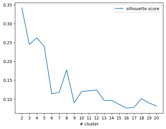
We can see that the silhouette score is going down chaotically, showing an abrupt spike at #8 clusters, followed by a subsequent decline. So I made an arbitrary decision to proceed with 9 clusters.
Graph summarizing the clustering results
The following graph shows the 9 clusters on the left side, completed with the silhouette scores of each timeseries for each cluster on the right side. To get the best insight possible, I also added the most frequent words for each cluster in the titles. The most frequent words are parsed from the name of the time series.
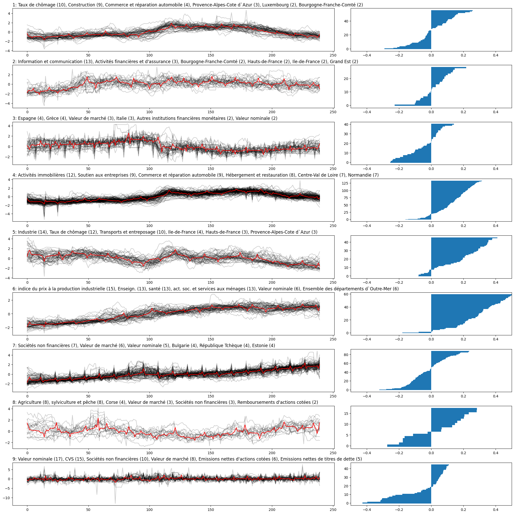
Looking at this graph, several observations can be made:
- The number of samples by cluster is pretty unequal, ranging from 15 to more than one hundred
- The first three clusters and the last three clusters exhibit a notably lower quality, with silhouette scores of their samples fluctuating between -0.5 and 0.5
- Interpreting the most prevalent words in the titles proves to be challenging, as they encompass various types of data categorizations, including geography and economic domains.
While I didn’t uncover any particularly intriguing insights within this set of time series, I’ve provided you with links to the data files and notebook files I utilized. With your domain expertise, you may have a better chance of identifying meaningful clusters. Enjoy exploring!