Time series analysis on Coronavirus data
Updated on march 10th 2020
Coronavirus is a virus that has been spreading globally, killing more than four thousand individuals. It is a major public health concern. The outbreak has been linked to a wet market in Wuhan which sold animals including fish and birds – and not just dead ones. There are concerns that the source of the virus may be bats. A vaccine is being developed. However, most of the infections are mild, which means they do not pose a threat.
In this post, I perform a brief analyis of the data we have for now (last update on march 10th 2020). You can find the entire notebook at this link.
Import the data from CSSEGISandData
Let’s take a quick look at the imported data from the CSSEGIS repository. We’ll carry the following investigation on the time serie of the confirmed cases. Basically it just represents the total number of confirmed cases by Province and by State.
Here is an example of the first rows and columns of the “time_series_19-covid-Confirmed.csv”
| Province/State | Country/Region | Lat | Long | 1/22/20 | 1/23/20 | 1/24/20 | 1/25/20 | 1/26/20 | 1/27/20 | |
|---|---|---|---|---|---|---|---|---|---|---|
| 0 | Anhui | Mainland China | 31.8257 | 117.2264 | 1 | 9 | 15 | 39 | 60 | 70 |
| 1 | Beijing | Mainland China | 40.1824 | 116.4142 | 14 | 22 | 36 | 41 | 68 | 80 |
| 2 | Chongqing | Mainland China | 30.0572 | 107.8740 | 6 | 9 | 27 | 57 | 75 | 110 |
| 3 | Fujian | Mainland China | 26.0789 | 117.9874 | 1 | 5 | 10 | 18 | 35 | 59 |
| 4 | Gansu | Mainland China | 36.0611 | 103.8343 | 0 | 2 | 2 | 4 | 7 | 14 |
This dataset contains records for 112 countries about confirmed cases from the 22th of january until the 10th of march 2020.
Let’s pick some countries and print their confirmed cases over time.
Visualisation
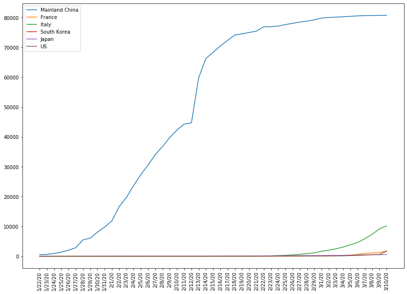
The following graph shows the evolution of the cumulative number of confirmed cases for China, France, Italy, Korea, Japan and the US.
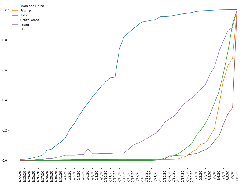
To better visualise the progression of the other countries we simply divide each series by the number of cases up to the 10th of march.
If we’d like to compare the evolution of the virus between China and some european countries, it would be more relevant to take as a reference point the province of Hubei which has a population of about 60 million and a density of 310/km². For a matter of comparison, here is a population and density table of some countries.
| Country | Population (million) | Density (population/km²) |
|---|---|---|
| China | 1401 | 145 |
| US | 329 | 34 |
| France | 67 | 123 |
| Italy | 60 | 200 |
| (Hubei) | 60 | 310 |
| South Korea | 52 | 517 |
Correlation
We continue our exploration by comparing the correlation between time series. We are trying to identify time lagged cross correlation, in other words, if one time serie leads another one and by how many days.
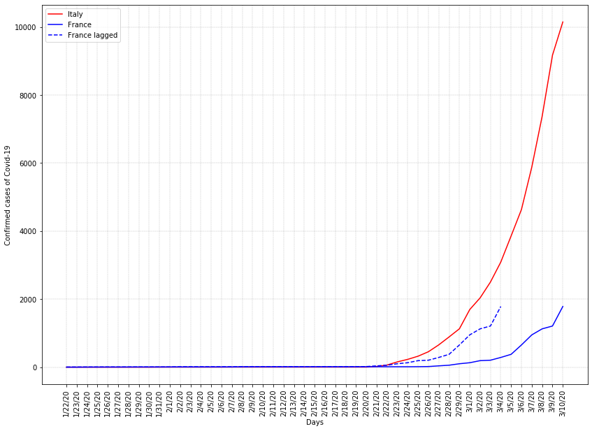
Let’s begin with two relatively similar countries: Italy and France.
Italy vs France: epidemy starts about 6 days later in France (or 8 ?)
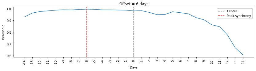 Correlation between Italy and France seems to be higher when France is 6 days behind. So let’s print that and see.
 With human eyes, France appears to be 8 days behind and not 6 as we previously compute. Origin of the error may come from the data recorded before the epidemy starts in each country.
Hubei vs Italy: epidemy starts about 37 days later in Italy but what’s for the quarantine ?
It’s quite intersting to compare confirmed cases between Italy and the province of Hubei (Mainland China) because they have similar characteristics in term of population and density.
| Country | Population (million) | Density (population/km²) |
|---|---|---|
| Italy | 60 | 200 |
| (Hubei) | 60 | 310 |
This time, we removed the first useless data points from Italy. So be carefull reading the synchrony diagram because we removed the first 28 days.
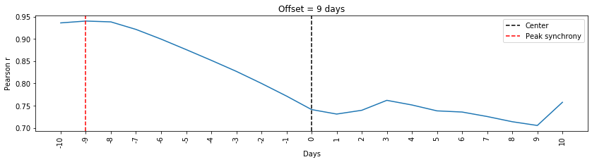
Let’s now print the confirmed cases of Hubei and Italy with a 37 days (28 + 9) delay.
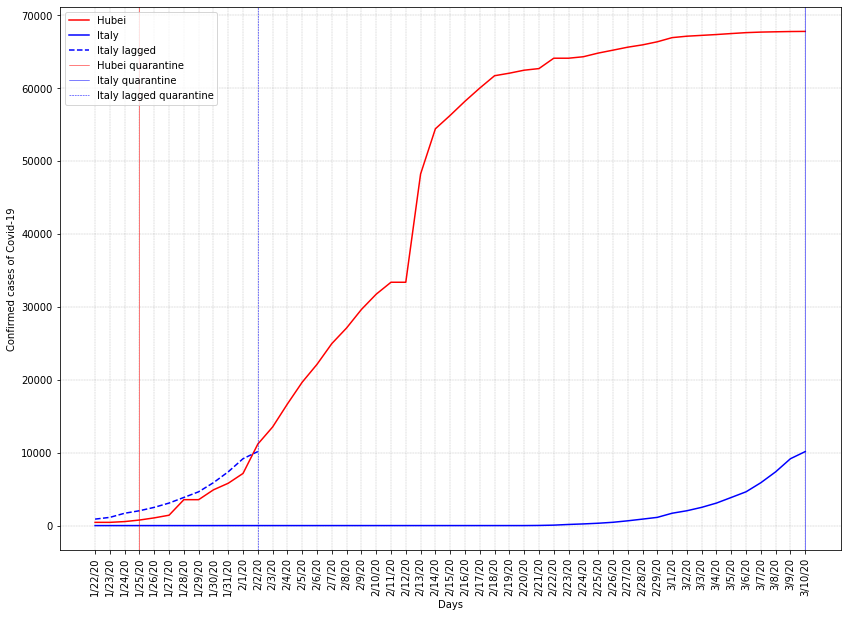
Despite a relative small error which should be minimize by using a filter (Kalman or rolling window ?), what’s strike me the most here is the delta between the quarantine policies. Hubei quarantine occurs the 25th of january whereas the quarantine of Italy occurs on the 10th of march, which is equivalent to the 2nd of february, if we overlap the curves. It’s more than a week delay !
Now that we compared the quarantine delay, let’s evaluate the quarantine effect, that is, after what period of time seems the quarantine to slow down the propagation ? On the following graph we fit the evolution of the confirmed cases in China to a sigmoid function, which enables us to have an evaluation of the point of inflexion, when the declaration of new cases starts to decrease.
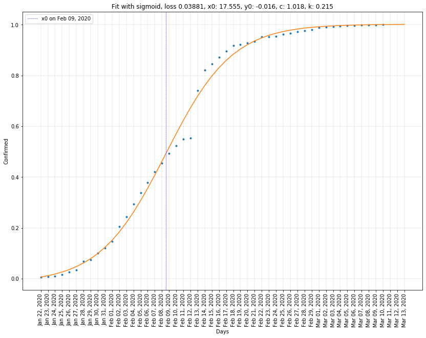 For China, the point of inflexion seems to be around 14 days after the quarantine event. Will it be the same for Italy ?
Related posts
Sources
- Coronavirus data
- Correlation and synchrony
- Intro has been written with the help of gpt-2